📈 A Complete Guide to Line Profile Analysis
PhenoCapture AI’s Line Profile tool is an incredibly powerful analytical feature that extracts and graphs the exact pixel values along any line you draw on your image. Whether you are a researcher measuring cell boundaries under a microscope, or a photographer analyzing a light gradient, this tool instantly translates visual information into precise, mathematical graphs.
Here is everything you need to know to start analyzing your image cross-sections perfectly.
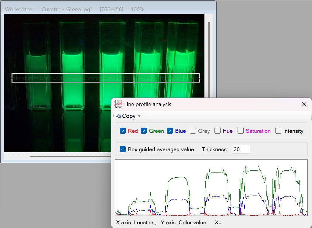
💡 Key Features
- Multi-Channel Graphing: View the exact pixel distribution along your line across seven distinct channels: Red, Green, Blue, Gray, Hue, Saturation, and Intensity. You can view them all at once or isolate a single channel.
- Smart Average Calculation: When you select only one specific channel to view, the software automatically calculates and displays the Average (Mean) Value of all the pixels along that line.
- Adjustable Line Thickness: Don’t let a single noisy pixel ruin your data! By checking the Box Guided option, you can increase the line thickness. The software will average the pixel values across the thickness of the band, providing a much smoother and more reliable data curve.
- Interactive Tracing: Not sure which peak on the graph corresponds to which part of your image? Simply click and drag your mouse across the graph! A real-time crosshair will appear on your main image workspace, showing you exactly where that specific data point is located.
- Instant Export: Extracting data is a breeze. Click Copy Image to paste the visual graph into a report, or click Copy Data to send the raw, tab-separated numbers straight into Excel for deeper analysis.
🛠️ How to Use the Line Profile Tool
Analyzing cross-sections of your image is fast and highly interactive. Follow these steps:
Step 1: Draw Your Measurement Line
When the Line Profile tool opens, the straight line tool is automatically activated. Simply click and drag across the specific object or area in your image you want to analyze. The graph will instantly populate with data.
Step 2: Choose Your Data Channels
Use the checkboxes on the panel to turn different color or intensity channels on and off. If you are looking for the overall brightness curve, try checking only Intensity or Gray.
Step 3: Adjust the Thickness for Smoother Data
If your graph looks too jagged because the image is grainy, check the Box Guided option and increase the Line Thickness. The tool will transform your thin line into a thick band, averaging the pixels together to give you a beautifully smooth and accurate profile.
Step 4: Trace and Export
- Want to inspect a spike in the graph? Click and hold your mouse on the graph’s curve. Look at your main image to see the perpendicular marker highlighting the exact pixel on the line.
- When you have the perfect data, use the top menu to copy the raw numerical data or the visual graph image to your clipboard.
With the Line Profile tool, transforming visual gradients and object boundaries into highly precise, exportable data is completely effortless!