📊 A Complete Guide to the Histogram Tool
PhenoCapture AI’s Histogram tool provides a powerful visual representation of the color and tonal distribution in your image. Whether you are a photographer checking for perfect exposure, a designer analyzing color balance, or a researcher extracting precise pixel data, this tool gives you instant, comprehensive insights into your image.
Here is everything you need to know about reading and utilizing your image data.
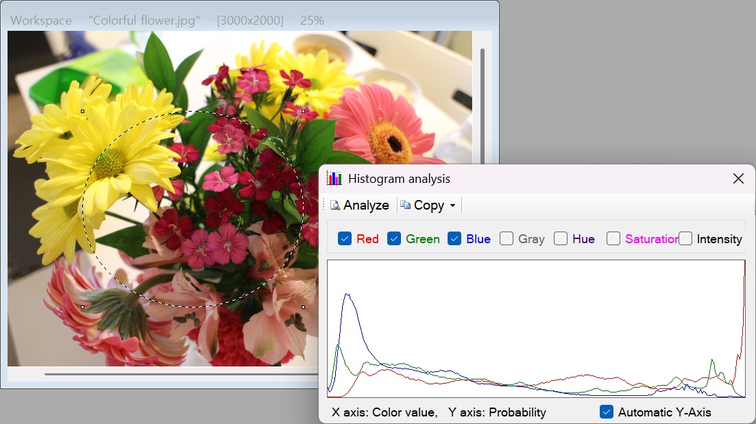
💡 Key Features
- Multi-Channel Analysis: View the exact distribution of pixels across seven different channels: Red, Green, Blue, Gray, Hue, Saturation, and Intensity. You can toggle multiple channels on or off simultaneously to compare them on the same graph.
- Smart Auto Y-Axis: Sometimes, the highest peak in a histogram makes the rest of the data look flat and unreadable. By checking the Auto Y-Axis option, the graph intelligently recalculates and scales the height based only on the active channels, ensuring every detail is clearly visible.
- Instant Data Export: Need the raw numbers for a spreadsheet or a report? Click Copy Data to instantly send the tabulated numerical data (0-255 distribution) to your clipboard, or click Copy Image to copy the visual graph directly.
- Real-Time Responsiveness: The histogram recalculates and redraws instantly when you resize the window or change your channel selections, ensuring a perfectly smooth analytical experience.
🛠️ How to Use the Histogram
Analyzing your image data is quick and highly intuitive. Just follow these steps:
Step 1: Open the Histogram
When you open the Histogram tool, it will automatically analyze your current workspace image or your active selection area.
Step 2: Select Your Channels
Use the checkboxes on the panel to turn different data channels on or off. You can look at the overall lightness using Gray or Intensity, check color vibrancy with Saturation, or break down the individual Red, Green, and Blue levels.
Step 3: Enable Auto Y-Axis (Recommended)
If your graph looks too flat or compressed at the bottom, simply check the Auto Y-Axis box. The software will instantly zoom the vertical axis to perfectly fit the highest peak of your currently selected channels, revealing hidden details in the data.
Step 4: Export Your Results
Once your graph looks exactly how you need it:
- Click Copy Image to paste the visual graph into a document or presentation.
- Click Copy Data to paste the raw, organized pixel counts directly into Excel or any other data analysis software.
With the Histogram tool, unlocking the deep mathematical and visual data behind your images is just a click away!